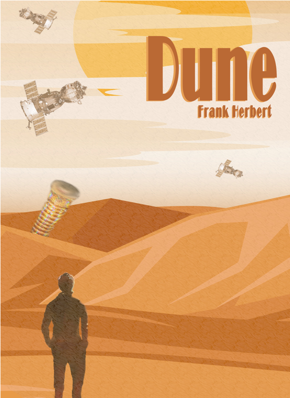
Dune Book Cover
For the book cover, I wanted to design something for Dune by Frank Herbert. I knew creating a sandworm image would be challenging since they don’t exist, but I was excited to try. I started by importing a background photo and lowering the saturation so it looked more like the muted, desert atmosphere of Arrakis. Then I added an image of a person standing with their back to the viewer, cut out the background using the scissor select and Ctrl+X, and cleaned the edges with the erase and blur tools so they blended naturally into the scene.
Once the person was placed, I brought in the image I planned to use as the sandworm. I experimented with several settings to get the look right and eventually used the blur tool to shape the mouth, then softened and desaturated the rest of the worm so it matched the overall tone. I positioned it behind the dune by aligning the bottom edge and erasing part of it to make it appear as though it was emerging from the sand. After that, I imported an image of a satellite to represent the transport ships visiting Arrakis for spice. I cut out the background, recolored it using a lighter tone from the sky, reduced the opacity, and duplicated the layer three times with different rotations and scales so each ship appeared at a different distance.
To finish the environment, I used one of GIMP’s preloaded textures—“Dried mud”—to create the sandy air common on Arrakis. I stretched, rotated, and sheared it until it covered the background in a way that looked like blowing sand, then lowered the opacity. The final step was adding the title and author’s name. I chose a bold font, spaced out the letters, and used the eyedropper to pull a color from the background. For more depth, I duplicated the text layers, offset them slightly, and used another background color to create an outline.

